
Showing posts with label website. Show all posts
Showing posts with label website. Show all posts
Friday, 31 October 2014
New Careers Service website
We now have a new Careers Service website bristol.ac.uk/careers. It's been up a while but I've only just got round to posting this. It will continue to evolve but it's a huge improvement on what we had before thanks to a real team effort, lots of user research and testing, and support from our web team and pureusability.co.uk
Friday, 12 September 2014
How Spotify build a product
I've been thinking about website design for a while now, especially in relation to our new University of Bristol Careers Service site (which thankfully will be up and running soon). I bought in some usability expertise from Stuart Church, and a while ago he shared with me a rather grainy photo of a slide, presumably taken from the back of a room at a talk something to do with web usablity. Unfortunatley I couldn't find the orginal source but it was so useful I re-drew it (apologies to the originator). So here it is, just in case it's of use to anyone else (and the title of the slide in question was 'How Spotify build a product')
Not like this...

Like this!

The Government Digital Service desing prinsiples are also really useful - gov.uk/design-principles
Not like this...
Like this!
The Government Digital Service desing prinsiples are also really useful - gov.uk/design-principles
Monday, 21 July 2014
University of Bristol Careers Service website - employer survey
Tuesday, 15 July 2014
Careers website survey - if you're a University of Bristol student or graduate I need your help!
If you've seen our Careers Service website you'll know that it needs some work (understatement). I've been wanting to get to it since starting at the end of January (and blogged some initial thoughts about it here). Well, finally the project is underway (with help from pureusability.co.uk/) and we are starting with a survey of users of the site. An employer survey will follow but we're starting with students and recent graduates of University of Bristol. There are 14 questions and it should only take you about 5 minutes but your feedback will be invaluable in shaping the new site. At the end of the survey there's also the opportunity to opt into being involved in some more in depth research (for which you will receive Amazon vouchers). So if you can help please complete the survey (and please, RT, repost etc.) Thanks!
Monday, 24 February 2014
Maybe we don't need a Careers Service website

After a meeting with Urfan and Ben from our web team on Friday I had the rather radical thought that perhaps we shouldn't have a Careers Service website at all. Let me explain...
Anyone who's give much thought to web architecture and user experience knows that the starting point for a site should never be the organisational structure but rather what the users of the site actually need/want from the service. So I mocked up a site on Google Sites (I might share it some other time) which I tried to base on user journeys rather than organisational structure, This got me thinking about things from an institutional perspective - in having a Careers Service website maybe I would just be doing the same thing at a different level i.e. creating a website around an organisational structure and so reinforcing organisational silos rather than thinking about things from the student persepctive. Instead of a Careers Service site perhaps we need a 'Help me get to where I want to be when I graduate' site, which is a lot broader and pulls in a much greater breadth of services and student experience (although clearly the name needs some work!).
Having said that, the Careers Service needs a profile and an identity in order to encourage student engagement with it, so I'm not sure I entirely agree ith myself; just thinking out loud.
I'd be interested in your thoughts though.
More to follow...
Tuesday, 9 August 2011
Careers website now live

- clearly signposts to our different audiences
- makes our social media links more prominent
- allows us adequate advertising space for featured items
- uses white space more effectively
- Students and Alumni
- Employers
- Staff (this area still needs work)
- included it in the subtitle
- given it its own url - www.le.ac.uk/succeedinyourstudies
- renamed the tab above the crumb trail from 'Careers Services' to 'Learning Development'
There seems to have been change to the Student Development website so that now when I go to access it, the Careers Service site comes up. It’s difficult to see from here how to get to the section of the Student Development site that has the downloadable guides on. We refer our students to these quite a lot, so it now seems more awkward to do this. Is this is permanent change to the website do you know?Any suggestions?
Thursday, 21 July 2011
Careers website updates nearly done
I blogged a few weeks ago about the progress on our front pages revamp for www.le.ac.uk/careers and I'm pleased to say that we've now completed the main structural changes. Matt and I have been working on it off and on for a few weeks (Matt mostly on, me mostly off) with help from Vic and #Stephaniewhosnotontwitter. We've still got work to do but the main front page is now active...


...as are new pages for each of the three main audiences:
I think it's both cleaner and clearer but your comments will be much more useful than mine...
Monday, 27 June 2011
Staff pages revamp
 |
| By dannyasmith |
I've had a quick look at: Durham's, Lancaster's, Manchester's and Warwick's (some of you will know why I started with these ;) I didn't get many ideas from them but it has made me think we need to make our DLHE data more prominent (currently it's tucked away in the Career Development pages for students). Also, advice for personal tutors (Durham) seems a good idea, as does a link to JobShop (Manchester's Jobs On Campus). But the best site I've found for staff pages is Exeter's, which includes:
- a staff guide to employability
- how they work with colleges/departments
- a section for Careers and Employability Reps (we call ours Careers Tutors)
- they also have some materials for group tutorials - but I need to figure out how they use these
Tuesday, 21 June 2011
New front page progress
Since putting up a post about We need a new front page and getting lots of useful comments, Matt and I are much closer to the finished article now. There's a screen shot below - the main changes have been:

Need to decide on the portlets to the right now. Are there any other changes we need to make at this stage?
- getting rid of the three themes above the images which looked like they should relate to the images below but didn't (thanks Steve)
- added space for an additional 'featured' image (thanks Marta), which we'll change every week
- changed 'what's hot' to 'featured' (thanks James)
- reduced the size of the 'follow' links (thanks Jonny)
- also added some explanatory text underneath each of the three audiences (this is draft - would be interested in opinions)

Need to decide on the portlets to the right now. Are there any other changes we need to make at this stage?
Wednesday, 11 May 2011
We need a new front page (again)
Back in July last year I blogged about our new front page for Student Development. At the time Alan made this comment...
.png)
This is only a first draft though and I'd be really interested in your comments. We can use portlets on the left or right hand side to include contact details and news items but the main part of the screen is what you see above. The 'What's hot' bit we can update on a frequent basis (not sure about the name but you get the idea). The 'Follow us' links can link to the individual accounts or pages with multiple accounts listed (for instance - I might set up a Twitter account solely for jobs and internships advertising in addition to our current one). We also need to think about what we do with the next level down: Students and Alumni can link to a page which is broken up into succeed in your studies, gain experience and develop your career; the Employer section can link to our Employer Liaison pages (we'll be revamping these shortly); and the staff section can link to what is currently a very embryonic staff folder (I'll need to develop this pretty quickly). I'd also appreciate suggestions of what I could replace the nasty banner image with (see below - I've never liked it but changing it hasn't been a priority up to this point), maybe something a bit like the Environment Team's (not the fridge magnet idea but the separate images idea).

One concern I have is that, other than the 'What's hot' box, we've used the whole of the centre of the page for static items. Is that ok or should we put a dynamic news feed in? It looks quite fresh now but it could quickly feel dated if it remains relatively static.
I should also probably run all this by my colleagues in Marketing to check they're happy (note to self).
All suggestions gratefully received :)
I understand the problem, but it's a bit busy for my liking - too much text to scan, too many distractions. [...] If it were me, I'd go for less, but allow people to drill down easily. Sorry, I know you worked hard on this [...]I think Alan was right (you can see the current page here) but I didn't want to change it again so soon after coming up with the redesign (not least because it was a big improvement on the previous version and that was the main thing at that point). My response at the time was that I'd let it run for a while and then revisit it - well now we have chance to revisit it, not least because of the renaming thing. I've had a look at a number of other similar services at other institutions including Manchester, Warwick, Lancaster and Durham, and as you will see if you click on the links they all use a similar structure at the top level, i.e. students, employers and staff - which I think is spot on. So that was what I discussed with Matt a couple of weeks ago and this is what he's come up with, which I think is great (he's blogged about it here)!
.png)

One concern I have is that, other than the 'What's hot' box, we've used the whole of the centre of the page for static items. Is that ok or should we put a dynamic news feed in? It looks quite fresh now but it could quickly feel dated if it remains relatively static.
I should also probably run all this by my colleagues in Marketing to check they're happy (note to self).
All suggestions gratefully received :)
Wednesday, 20 October 2010
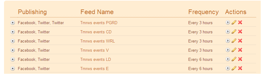
I've just decoupled the events feed
Having been quite pleased with myself a year ago for figuring out how to automate events notification from our website to Facebook and Twitter I've decided to turn it off. News items will continue to push out automatically but Vic, James and I decided that the events notification was just too noisy. Vic is now taking more of a specific responsibility for updating our Facebook and Twitter accounts and it's a much better tone and timing than the automatic events feed (see this for an example). James is beginning to do the same for the postgraduate researcher development accounts. Would be interested to hear what you think...
Friday, 6 August 2010
I've just discovered image maps

Below is a photograph of Tryfan that I took last time I went up it. It's not the best example but I wanted to demo something that doesn't have straight lines. So if you hover over the image you'll discover various links:
- the stile links to the Wikipedia entry on stiles (fascinating, I'm sure)
- the wing mirror links to the 'Let me Google that for you' link for the same
- and the rocky profile that is Tryfan links to the Wikipedia entry on Tryfan (and if you hover carefully you'll see that the image map for that follows the skyline of the ridge)

Update
Looks like uploading the image is a bit flaky (worked to start with then stopped working) so I've recreated it with a url to the image to see if that's better...
Monday, 19 July 2010
New front page done
Matt and I have been thinking about a design for a new front page of the Student Development site for a while now, and now it's done. After some really useful comments to previous posts (New front page progress and We need a new front page) we've finalised a design. It's not brilliant because we're working with some quite tight restrictions in our Plone CMS and we're having to do everything in tables, but I think it's a lot better than it was. We now have a lot more space to promote current news and events and the rather confusing team structure has been replaced by three clear themes. There's also more white space than there was.
Hover over the image below so see notes, or just go to www.le.ac.uk/studentdevelopment
Hover over the image below so see notes, or just go to www.le.ac.uk/studentdevelopment
Thursday, 8 July 2010
New front page progress
I've been thinking on and off for about a month now about how we can improve the front page of the Student Development website. I blogged about it a while back (We need a new front page) and got some very useful comments.
The reasons for redesigning it are:

We're working within quite a restrictive CSS in Plone so it's not easy to make it look quite how I want it to but it's getting closer. You'll see I've put a space holder image in for story 1 - the reason being I couldn't find an image of the correct dimensions (long and thin) to go in that bit - which probably means that bit's not ideal.
There are still things I need to do, including:
Student Development staff can login to see the most up-to-date version here.
The reasons for redesigning it are:
- to give us more space to promote topical news and events
- to theme our work under three main headings to give what we do more coherence (succeed in your studies, gain experience, plan for a career)
- to make things easier to find
We're working within quite a restrictive CSS in Plone so it's not easy to make it look quite how I want it to but it's getting closer. You'll see I've put a space holder image in for story 1 - the reason being I couldn't find an image of the correct dimensions (long and thin) to go in that bit - which probably means that bit's not ideal.
There are still things I need to do, including:
- put in an obvious Information for employers link somewhere
- maybe also put in a link for PhD students to supplement the mentions they get within the three themes
Student Development staff can login to see the most up-to-date version here.
Tuesday, 8 June 2010
We need a new front page
Our current Student Development front page has served us well for nearly a year now. When I wrote about the plans for it a year ago I explained the criteria for the design and the proposed structure. Since then the structure of the front page has remained largely unchanged but there are now reasons to update it, here are the three main ones:
I'm hoping these headings will simplify things and so help us address the three reasons mentioned above. In terms of how it might look on the page here's a mock up (I'll figure out the relative sizes of the columns later) - click on the image to enlarge it.

I'm really interested to hear your comments; staff and especially students. Some questions to consider:
- we are running out of front page space, especially as more and more of our work involves more than one of our teams (for example, the Leicester Award);
- we need to give certain themes of our work more prominence - principally careers and support for postgraduate researchers;
- we need to make it easier for visitors to find what they are looking for (pushing out information to Facebook and Twitter has helped a lot in this regard but we need to make the front page itself more immediately self-explanatory)
- Learning Development
- Career Development
- Volunteering
- Work-related Learning (including Business and Enterprise Learning)
- Research Student team
- Employer Liaison
Succeeding in your studies
To include academic skills development for undergraduates and support for research postgraduates (the latter's web pages we will be restructuring over the summer - I blogged about some ideas last week)Gaining experience
To include work placements, volunteering and business and enterprise opportunities - for undergraduates and research postgraduates.Planning for a career
To include the support offered by the career development team (whose web pages we will also be restructuring over the summer) and the Research Student team - for undergraduates and research postgraduates.I'm hoping these headings will simplify things and so help us address the three reasons mentioned above. In terms of how it might look on the page here's a mock up (I'll figure out the relative sizes of the columns later) - click on the image to enlarge it.
- do the themed areas cover everything?
- are the themed areas termed correctly?
- will the proposed changes address the reasons for change (1-3)?
- does the draft layout make sense?
- do you have any other ideas or suggestions?
Thursday, 3 June 2010
Publicity channels
Part of my role in Student Development involves overseeing publicity. When I started in the role 18 months ago we were using only traditional forms of media to communicate with students; flyers, posters, emails and our website (all broadcast media that allow little or no two-way communication and simply pushes information to recipients). Since last summer I’ve been developing our networks on Facebook and Twitter (social media that does allow two-way communication and recipients select to ‘pull’ information towards themselves) to supplement the traditional methods. So we now have a range of publicity options available to us that I thought it would be helpful to outline – and if you have any suggestions or comments I’d be really pleased to hear them.
 Our website is our primary means of communication. I’m concious that we need to reorganise our front page (the subject of a future post) because we’re running out of space to put stuff, but that aside, here are elements I use within the site for publicity purposes.
News items (within Plone) are vital as they keep the website dynamic and also populate RSS feeds which I use to push out to Facebook and Twitter (see how here).
Event items also add a dynamic element to our site and populate RSS feeds in the same was as the news items do.
Top level portlets at the Student Development level of the website to highlight services that we want to give a particular push to at any given time. At the moment we’re doing this with our Graduate Success Programme (but we only have room to display one item like this at a time – which is one of the reasons we need to redesign the front page).
Team level portlets at the relevant team level – in the case of the Graduate Success Programme that’s in Career Development.
Mini sites to create an uncluttered site focussing on a particular event. In order to de-clutter an area I block the portlets above in the folder structure and start the navigation at the relevant level. If the event is to be a regular one Ialso request a specific URL, for example (again) www.le.ac.uk/graduatesuccess.
 As already described I’ve been using social media to try and engage with students for some time now. More recently my focus has switched from Twitter to Facebook and in particular how to encourage interaction not just ‘Likes’. To this end I’ve been trying the following:
 There are various plasma screens around campus which make up the University’s digital signage one of which is in the Student Development Zone. The screens generally operate on a 10 second cycle; scrolling through the notices set to display. The images and text displayed on these screens, therefore, have to convey information quickly and simply.
More important than our own screen (the traffic that it gets is limited given our location) are the other screens around campus – in particular in the Help Zone on the Ground floor of the Library, the Graduate School Reading Room, the Library Cafe and (especially) the screens in the Students’ Union.
Print
And for completeness I thought I should mention print. Although for publicity purposes we’re beginning to move away from print because it’s usually high cost for a relatively low impact.
Any suggestions? Have I missed anything?
Website
News items (within Plone) are vital as they keep the website dynamic and also populate RSS feeds which I use to push out to Facebook and Twitter (see how here).
Event items also add a dynamic element to our site and populate RSS feeds in the same was as the news items do.
Top level portlets at the Student Development level of the website to highlight services that we want to give a particular push to at any given time. At the moment we’re doing this with our Graduate Success Programme (but we only have room to display one item like this at a time – which is one of the reasons we need to redesign the front page).
Team level portlets at the relevant team level – in the case of the Graduate Success Programme that’s in Career Development.
Mini sites to create an uncluttered site focussing on a particular event. In order to de-clutter an area I block the portlets above in the folder structure and start the navigation at the relevant level. If the event is to be a regular one Ialso request a specific URL, for example (again) www.le.ac.uk/graduatesuccess.
Social media
- extra Facebook and Twitter updates (as per Helpdesk Hollie’s advice) in addition to our automated RSS outputs
- a specific Facebook push – like we tried recently with Revision and exam skills (which seemed to work)
Digital signage
More important than our own screen (the traffic that it gets is limited given our location) are the other screens around campus – in particular in the Help Zone on the Ground floor of the Library, the Graduate School Reading Room, the Library Cafe and (especially) the screens in the Students’ Union.
Newsletters
Because not everyone looks at our website or joins our social media networks we also send out a monthly newsletter to all students. This comprises of just a few highlights plus a link to further highlights of the month’s news from our news feeds. Click here for the June edition.Any suggestions? Have I missed anything?
Tuesday, 1 June 2010
Postgraduate research student pages
We need to restructure the research postgraduate's pages of our website, in particular the resources section. We've known this for some time but haven't had the time to devote to it. A couple of weeks ago Matt and I had a meeting with the Research Student Team to begin to talk about the restructure and last week we met with Duncan to decide on some headings under which to organise content. We looked at the Joint Skills Statement of Skills Training Requirements (JSS) and the headings that Vitae use in the Postgraduate researchers section of their website. The headings we've come up with are a combination of both of these and are as follows.
In a minor update last week I changed the front page of the research postgraduate pages to be a summary view of the latest news items in order to make this page as up to date and dynamic as possible. I think the way Plone renders images attached to news items in the summary view works pretty well.
- Managing your research (Vitae = 'Managing your research project', JSS = A: research skills and techniques, C: research management)
- Managing yourself (Vitae = 'Managing your yourself', JSS = D: personal effectiveness)
- Communicating your research (Vitae = 'Raising your profile', JSS = E: communication skills)
- Developing your career (Vitae = 'Developing your career', JSS = G: career management)
- Supervision and key relationships (Vitae = 'Supervision and key relationships', JSS = B: research environment, F: teamworking and networking skills)
- Completing your doctorate (Vitae = 'Completing your doctorate', JSS = B: research environment)
In a minor update last week I changed the front page of the research postgraduate pages to be a summary view of the latest news items in order to make this page as up to date and dynamic as possible. I think the way Plone renders images attached to news items in the summary view works pretty well.
Thursday, 20 May 2010
Developments I'd like to see in Plone

I'm not a techie, but I have been using Plone now for more than four years so I know it pretty well from a user's perspective. Whilst there's no such thing as a perfect system I really like Plone and the ethos behind it, I especially like the flexibility of the sharing permissions that it gives us. The web team here at Leicester have done a great job in setting it up and supporting it with very limited resources (and for the record, they should get more).
So, here are some of the developments I'd like to see in the future (apologies in advance if I'm making any techie faux pas).
Selectively cascading portlets

Thumbnail images from news items into Facebook
I've set up news items to push out to Twitter and Facebook using the RSS and Twitterfeed (see this post for the Twitterfeed set up). What would be nice though would be if Plone could take a thumbnail of an image attached to a news item and put that in the Facebook post. Currently it doesn't do this so all our automated posts look very similar (look for the posts that come from Twitterfeed on our Facebook page)
NOT statement in collection fields
Within the Title and Description fields in collections it would be really useful if it allowed more logical statements. At the moment you can have AND and OR but not NOT. And NOT would allow more flexibility.More flexibility in the start date field in collections

- Item type = event
- Location = (relevant folder + search sub-folders)
- State = published
- Start date = 1 day, in the future, on the day
I've just looked at the criteria again and it looks like I should just be able change the 'which day' field to 2 days or 5 days or a week. That looks like it should solve my problem but I think I tried that before and it didn't work. I set it up more than six months ago though so I can't remember. I'll have another check but if anyone can tell me so I don't have to check that would be great :)
Bookmarklets
I understand there's an addon for bookmarklets (share on Twitter, Delicous, Facebook etc) but it conflicts with the feed mixer portlet. It would be good to get this fixed.Editor bugs
I prefer the TinyMCE editor to Kupu, on the whole, but there's a bug in TinyMCE which means that if you add a link to an image in a portlet the image dissapears (but works fine with Kupu editor).I've probably got some other suggestions but I'll just throw those out as a starter. It's not meant to be critical - just suggestions from an avid user.
Tuesday, 18 May 2010
The automated feeds are working
I've just realised that if you edit a news item in Plone that's already published and then save the changes it acts like a newly published item. How do I know this interesting piece of information, I hear you cry? Well, it's funny you should ask that...
 Yesterday I was showing a colleague how to create a collection in Plone that would pull in not only the news items that she published in her area of the website but also appropriate news items that others published elsewhere in the Student Development website. So in order to demonstrate this I went to a relevant news item and categorized it (that's what Plone calls it but most people will call this 'tagging') and then saved the changes. The collection item was set up appropriately to display item type (="news item"), location (=http://www2.le.ac.uk/offices/ssds/sd), categories (="Leicester Award") and state (="published") - so the item was fed into the collection accordingly. However, it wasn't until I was on Twitter a few minutes later that I realised that adding a category to a news item (or presumably any kind of editing) and then saving the changes causes the item to be re-published. Not only did the news item appear in my colleague's collection it also re-appeared:


- at the top of the Volunteering team's latest news feed
- at the top of the Student Development latest news feed
- at the top of the news portlets on every page in the above two sections
- and on Facebook
- and on Twitter
The problem was the story was six months old! So we quickly added a sentence to the bottom of the news item to say "The deadline for completion of this year's programme has already passed, but you can register now for the 2010/11 programme."
As my colleague said "It's all good publicity". And at least I know all the feeds are working. Thanks for the retweets!
Thursday, 11 June 2009
Plans for a Student Development website

Criteria
The criteria we have established for the site so far are as follows:- users (especially students) can find what they want quickly and easily
- the navigation is easy to use
- the navigation uses self-explanatory and active language, where possible
- the structure is flatter to avoid 'burying' of items
- there are good cross references across the site to avoid 'siloing'
- the text is simple and concise
- there is good use of imagery
- pages are frequently updated - especially via dynamic feeds
- users can subscribe to RSS feeds, where appropriate
- the old URLs will still work
- there are clear areas of responsibility for different teams (an internal criteria)
Structure
We have decided to give each team its own folder (apart from Information Systems, Publications and Publicity - which doesn't need one) to help ensure that areas of responsibility are clear. So the top level folder structure will look like this:- Learning Development
- Career Development
- Research Student Team
- Work-related Learning (and probably a separate one for Enterprise?)
- Community Liaison
- Employer Liaison
- Learning Development becomes Develop your academic skills
- Career Development becomes [Suggestions please]
- Research Student Team becomes [Suggestions please]
- Work-related Learning, Enterprise and Community Liaison becomes Get the experience you need (with sub-headings Work placements, Enterprise, Volunteering)
- Employer Liaison becomes Information for employers
Each team folder would then follow the same (or similar) structure, as follows (with suggested active headings in brackets). Employer Liaison may need a different structure altogether - again, suggestions welcome.
- About us
- Resources (Find a resource)
- Consultations (Make an appointment)
- Workshops (Come to a workshop)
- Events (See our events)
Sample screen shots
Figure 1 shows the top level Student Development page. Note that the dynamic feeds are populated from the associated feeds at the team folder level. So, for example, events and news in the Research Student Team folder appear both in the Research Student Team folder (on its own) and at the top level Student Development page (aggregated with events and news from all the other team folders)
Figure 1: Top level Student Development page
Figure 2 shows a sample team folder level page (Postgraduate researchers). Note that at this level each team can also have their own Help with... area that is specific to their site users. The events and news items at this team level (as explained above) will feed into the top level Student Development page.

Other elements of the project
In addition to the site itself we will be reviewing the editing permissions of the site under the new structure and also running some training on how to use different elements of the content management system.What happens next
Please let us know your comments, either by commenting on this post or speaking to me, Matt or Fran. Thanks!
Subscribe to:
Comments (Atom)